Input Field
The Input Field widget allows users to input text, numbers, email addresses, or passwords into your app. It’s an essential component for creating forms, collecting data, and enhancing user interaction. Built with Material Design principles, the Input Field in LiveCode Create offers easy-to-use customization options for styling, behavior, and validation.
Adding an Input Field to Your Layout
-
Open the Tools Palette:
- Access the Tools Palette from the left panel in the LiveCode Create IDE.
-
Drag and Drop the Input Field:
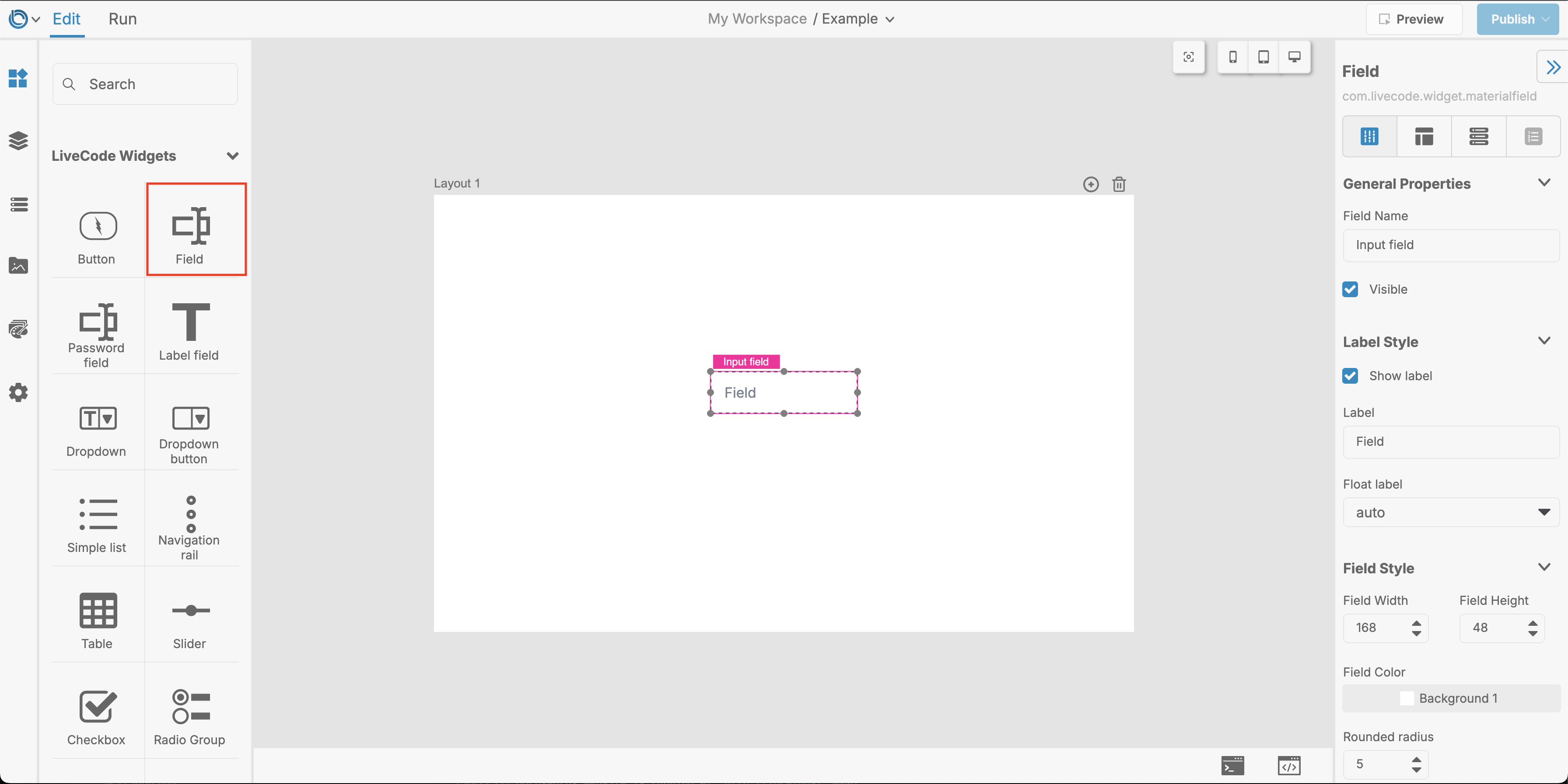
- Locate the Input Field widget in the Tools Palette and drag it onto your app layout in the Canvas Area.
-
Position and Resize:
- Adjust its position and size using the handles on the Canvas or the Layout tab in the Property Inspector.
 Note: The Input Field widget is referred to simply as Field in the Tools Palette. The Password Field is a Field with its Input Type set to
 Password.
Customizing the Input Field
You can configure the Input Field’s functionality and appearance directly in the Property Inspector. Below are the key options to explore:
Set the Purpose
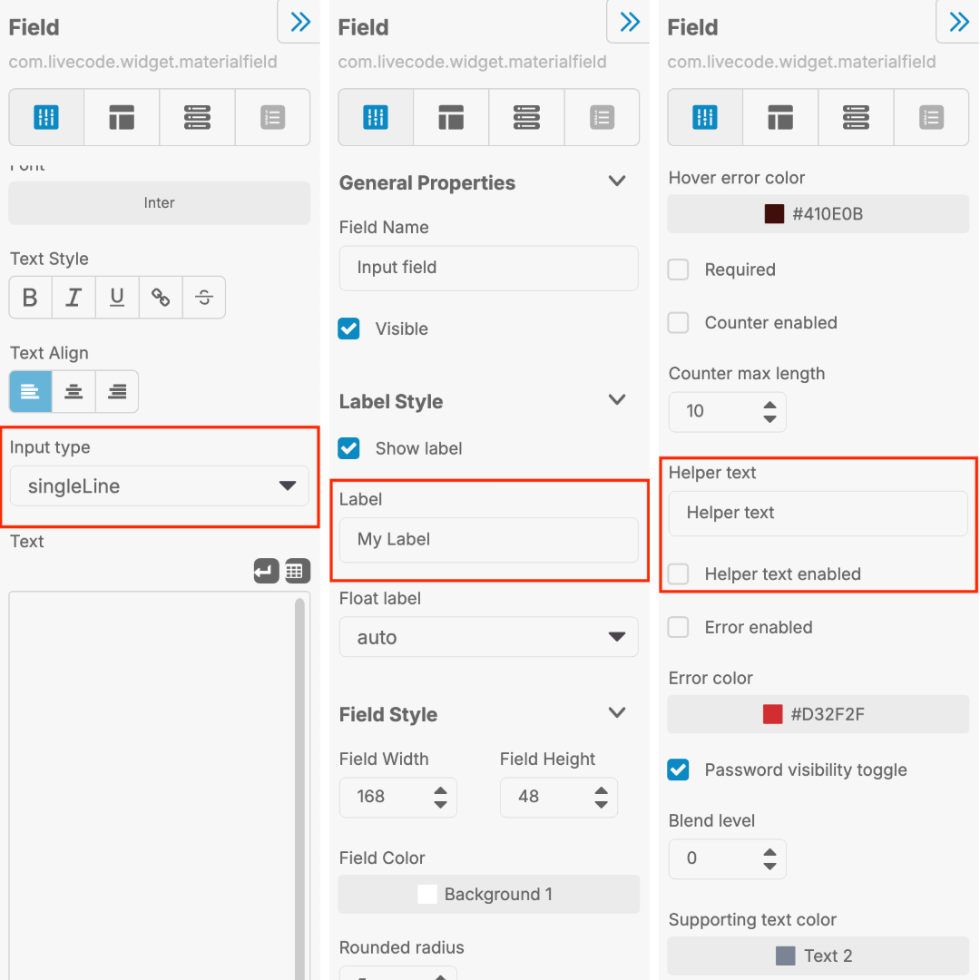
- Label: Add a descriptive label above the field (e.g., "Email Address" or "Name"). Enter this in the Label field of the Property Inspector.
- Input Type: Specify what type of data the field should accept:
- Text: General text input.
- Number: Accepts only numeric values.
- Email: Automatically validates email addresses.
- Password: Masks the input to protect sensitive data.
- Helper Text: Add a short hint or instruction below the field to guide users (e.g., "Enter your email"). Enable this in the Property Inspector and type your desired message.

Styling the Input Field
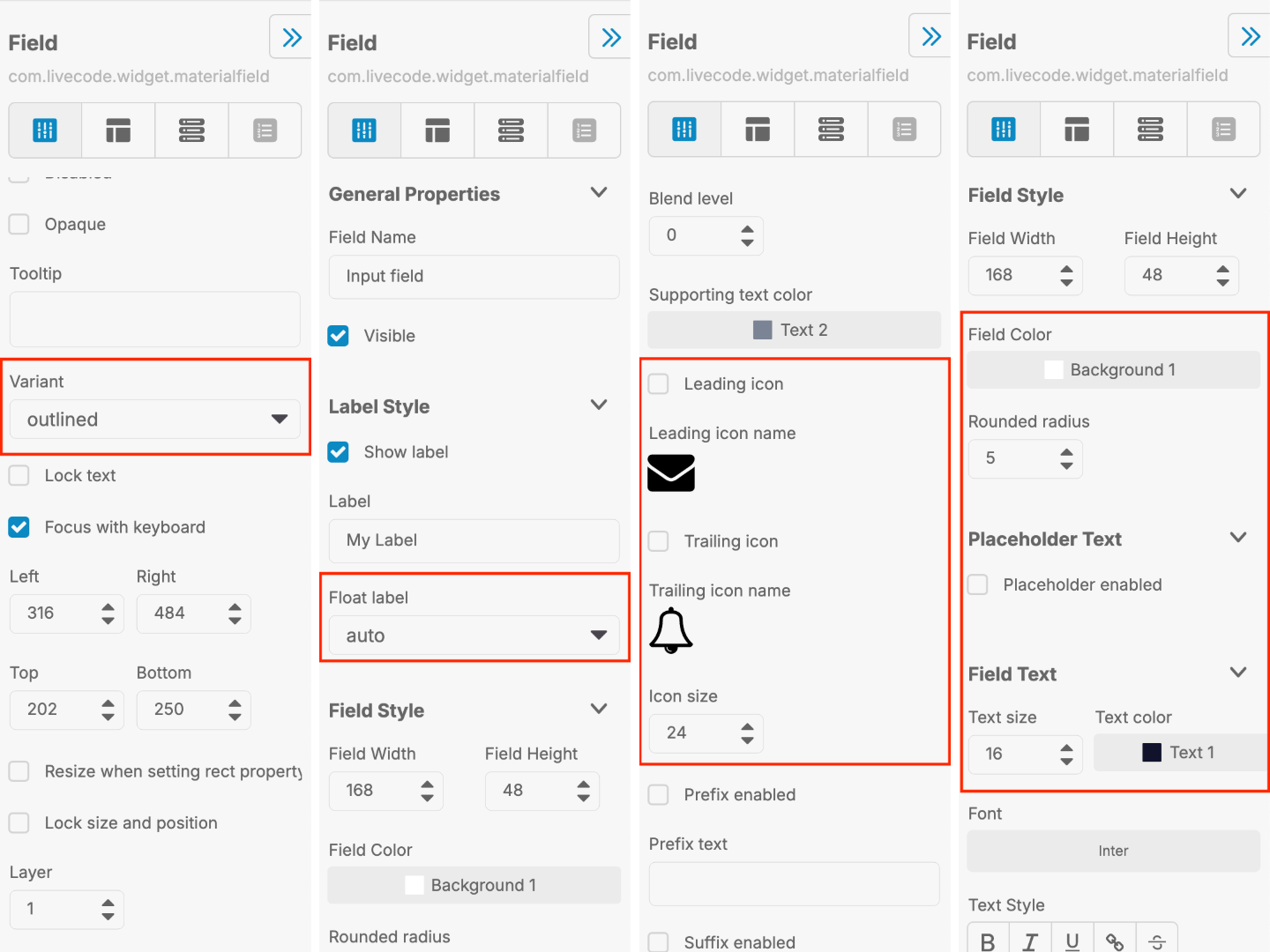
- Variant: Choose between two styles:
- Filled: A solid background with a single bottom border.
- Outlined: A border surrounding the field.
- Label Behavior: Set the label to always float at the top, float automatically when the field is focused, or disable the floating label.
- Leading and Trailing Icons:
- Add an icon before or after the text input. For example, use an envelope icon for an email field.
- Select the icon in the Property Inspector and adjust its size and color.
- Color Options:
- Adjust the text color, background color, and border color to match your app’s theme.
- Customize the hover and focus colors for a polished user experience.

Advanced Features
- Validation:
- Use the Input Type to set built-in validation for numbers, emails, or passwords.
- Enable the Required property to ensure users cannot leave the field blank.